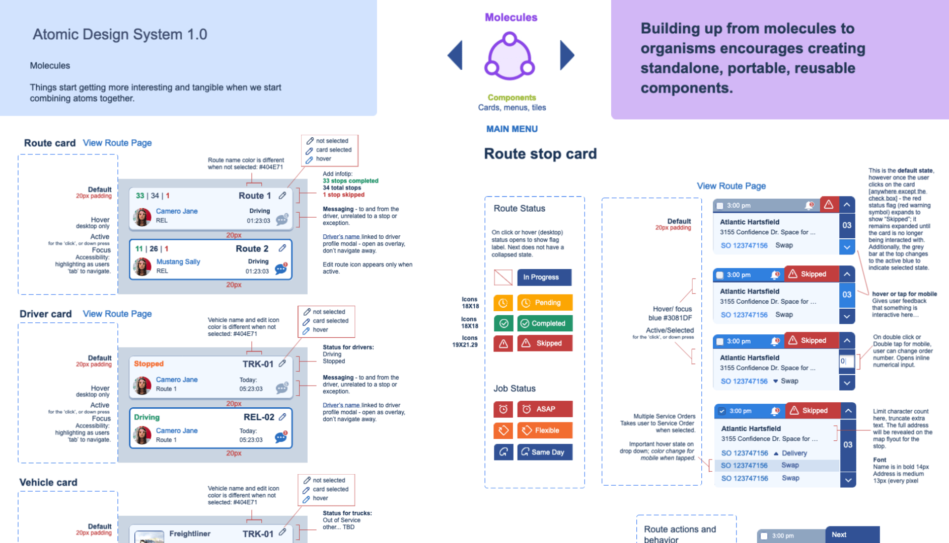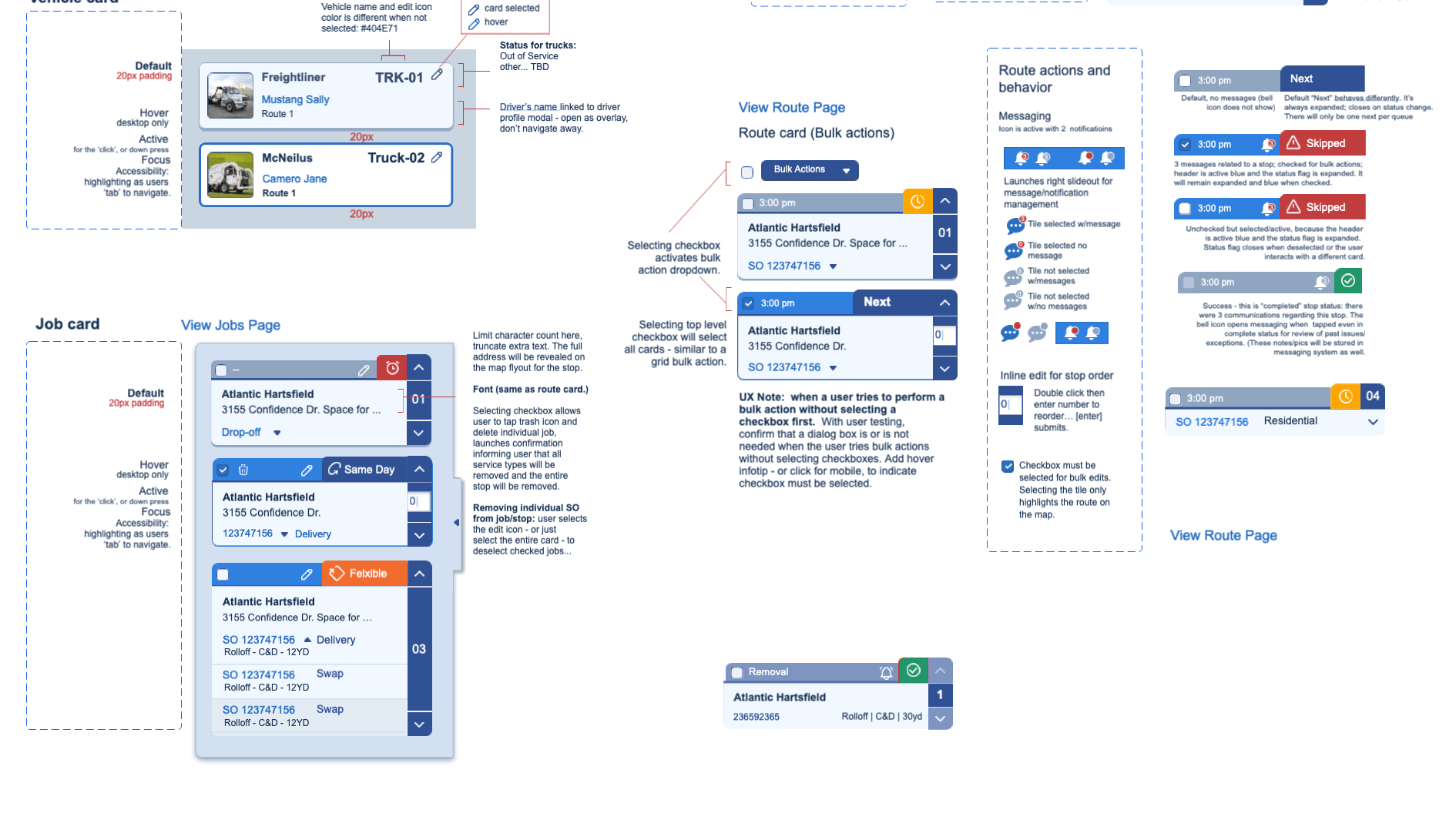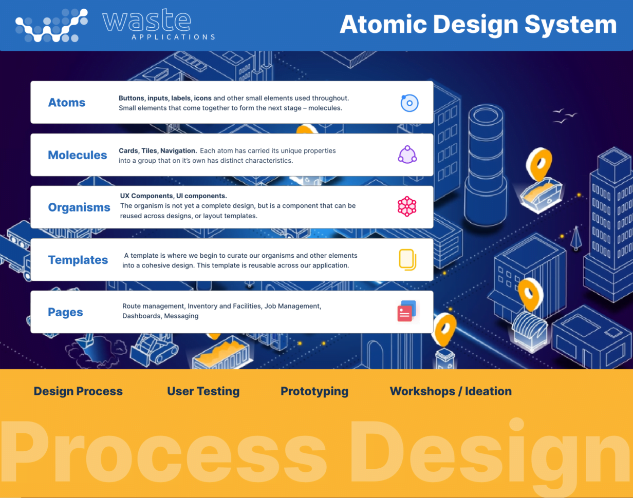
Atomic Design System for Waste Applications
Project Date: 7-19-2022
Lead Interaction Designer (SaaS) – Waste Applications, Atlanta, GA
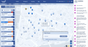
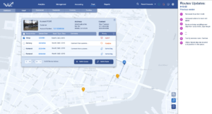
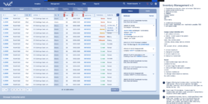
Tools: Jira | Figma | Adobe XD | Photoshop – Lead designer for startup environment with innovative waste management application. I created a design system for ongoing access to design assets using Figma, then moving assets to Adobe XD; created all wireframes, interactive prototypes and mockups for Dev teams; designed complex user workflows for routing systems, large dataset visualization with user- centered approach to information architecture, graphic/visual design, usability research/analysis. Provided a deep understanding of workflow for design systems, software development collaboration with design processes; and worked closely with development teams and managed a remote frontend developer. Performed user research to confirm innovative user flows and worked closely with product teams to define requirements.
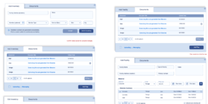
With Waste Applications I was starting with a clean slate, no styles, no language or visual direction for the design, only prepackaged Syncfusion components. I wanted to use Atomic Design System as a way to build up the styles, components and pattern library as we refined each screen of the app. We can break entire interfaces down into fundamental building blocks and work up from there. That’s the basic gist of atomic design.
Design system features:
- Color
- Data Visualization
- Grid System
- Typography
- Components
Design-System Repository
Here is one example of a design system with a set of standards to manage design at scale by reducing redundancy. My object is to work with research, development, product teams to creating a shared language and visual consistency across different pages and channels. Design repositories can take many forms, but for Waste Applications the contain a style guide, a component library, and a pattern library.
As UI designer over the years, the scale and speed at which UI screens must be created has increased. Consequently, a need for organizations to streamline design work has become key to fast, iterative design evolution. So, my design teams leverage robust design systems to manage designs at scale, especially for companies without such an organizing system
The Best Design System in the World?
Design systems, when implemented well, can provide a lot of benefits to a designer and cross-funtional teams:
- Replicate designs quickly by utilizing premade UI components and elements. Teams can use the same elements over and over, reducing unintended inconsistency.
- UI elements are created already and reusable. Design resources can focus less on tweaking visual appearance and more on more-complex problems (like information prioritization, workflow optimization, and journey management).
- Created a unified language within and between crossfunctional teams.
A unified language reduces wasted development time around miscommunications. - Created visual consistency across products, channels and departments.
Provide a single source of components, patterns, and styles and unify disjointed experiences so that they are visually cohesive and appear to be part of the same ecosystem. - An educational tool and reference.
Explicitly written usage guidelines and style guides help onboard individual contributors who are new to UI design or content creation.
