Creating UI for Enterprise and SaaS
Date: November 2019
Project: To create a design system for Ware2Go’s Enterprise app for merchants, order fulfillment and warehousing in one location. With my UI hat on, I setup a modern and flexible pattern library in conjunction with a components library. Additionally, my goal is to reduce user frustration by consolidating features into an expandable navigation experience and using APIs to automate feedback when possible. Enterprise UI/UX for with an omnichannel structure will operate more like a tool and less like a ecommerce platform. After evaluating the existing program and anticipating UX improvements, I set up the initial UI pattern library. I used Figma to share updates and assets with frontend development teams.
Key design elements for enterprise apps:
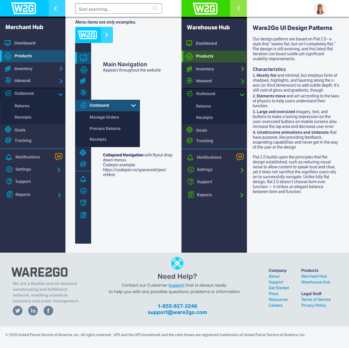
First, a key foundation is an expandable navigation, allowing new features from different iterations to be added as the app grows. Consequently, I was then able to create elements that operated more like a tool for faster task completion by reducing steps by providing nimble navigation. We used as much backend automation as possible (permission-based displays, APIs) to feed data to interfaces. (examples: vertical navigation that collapses to provide more working space, expandable visual data, inline non-modal notifications, etc.)
Ware2Go UI Design Patterns
I chose design patterns based on Flat 2.0 – a style that “seems flat, but isn’t completely flat.” Flat design is still evolving, and this latest flat iteration can boast subtle yet significant usability.
Characteristics
1. Mostly flat and minimal, but employs hints of shadows, highlights, and layering along the z-axis (or third dimension) to add subtle depth. It’s still void of gloss and gradients, though.
2. Elements move and act according to the laws of physics to help users understand their function
3. Large and oversized imagery, text, and buttons to make a lasting impression on the user; oversized buttons on mobile screens also increase the tap area and decrease user error
4. Unobtrusive animations and slide-outs that have purpose, like providing feedback, expanding capabilities and never get in the way of the user or the design
Flat 2.0 builds upon the principles that flat design established, such as reducing visual noise to allow content to speak loud and clear, yet it does not sacrifice the signifiers users rely on to successfully navigate. Unlike fully flat design, flat 2.0 doesn’t choose form over function — it strikes an elegant balance between form and function.
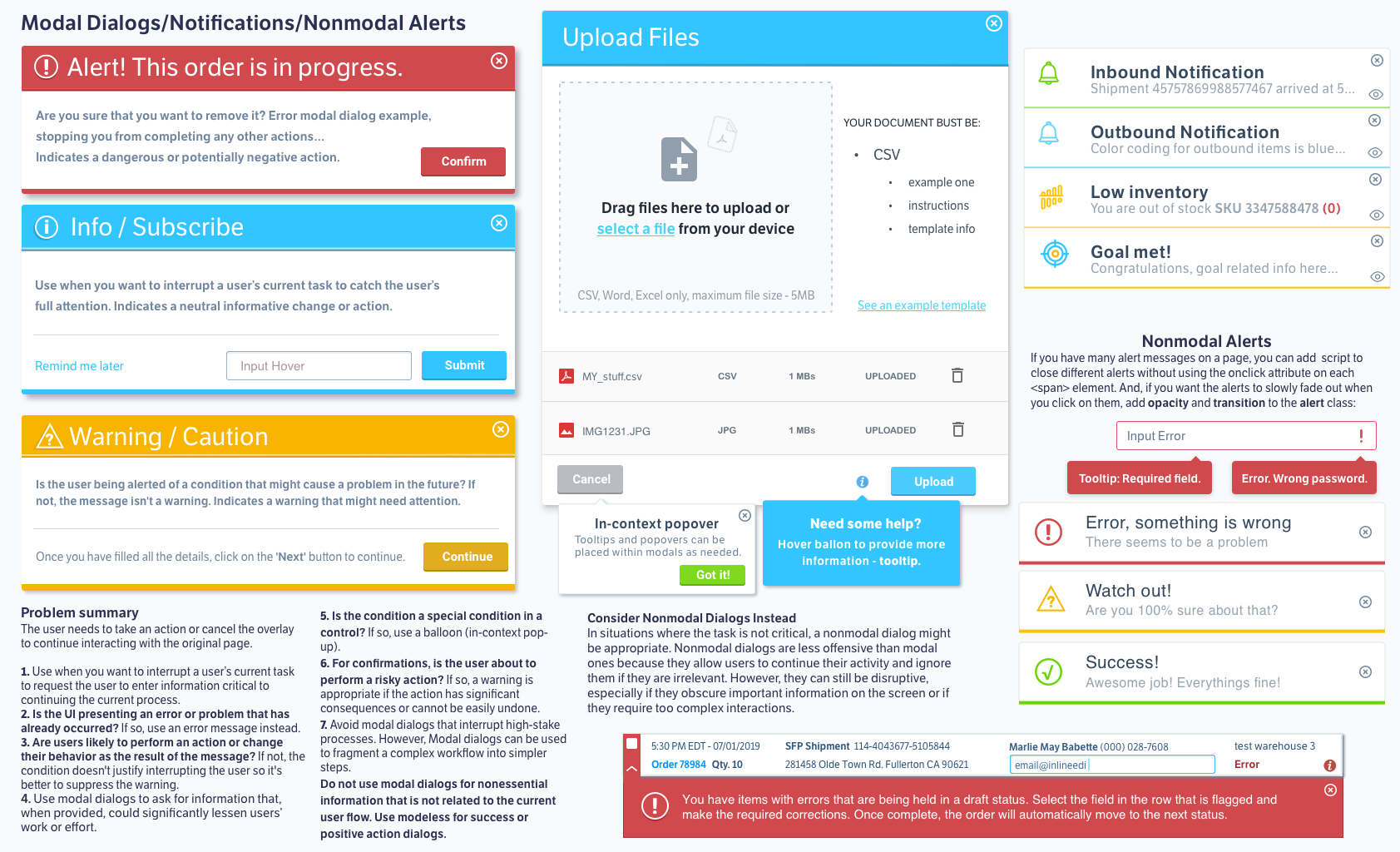
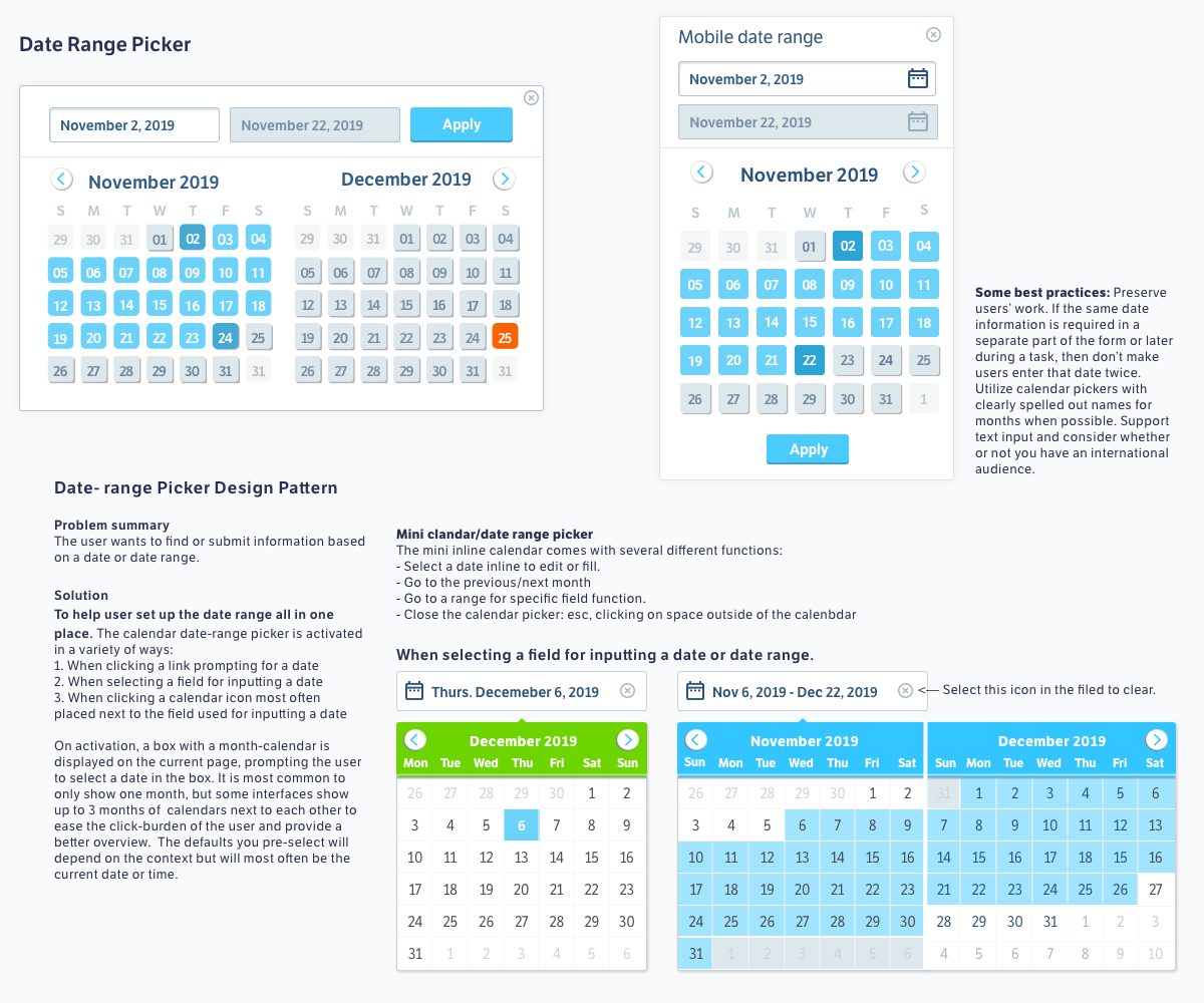
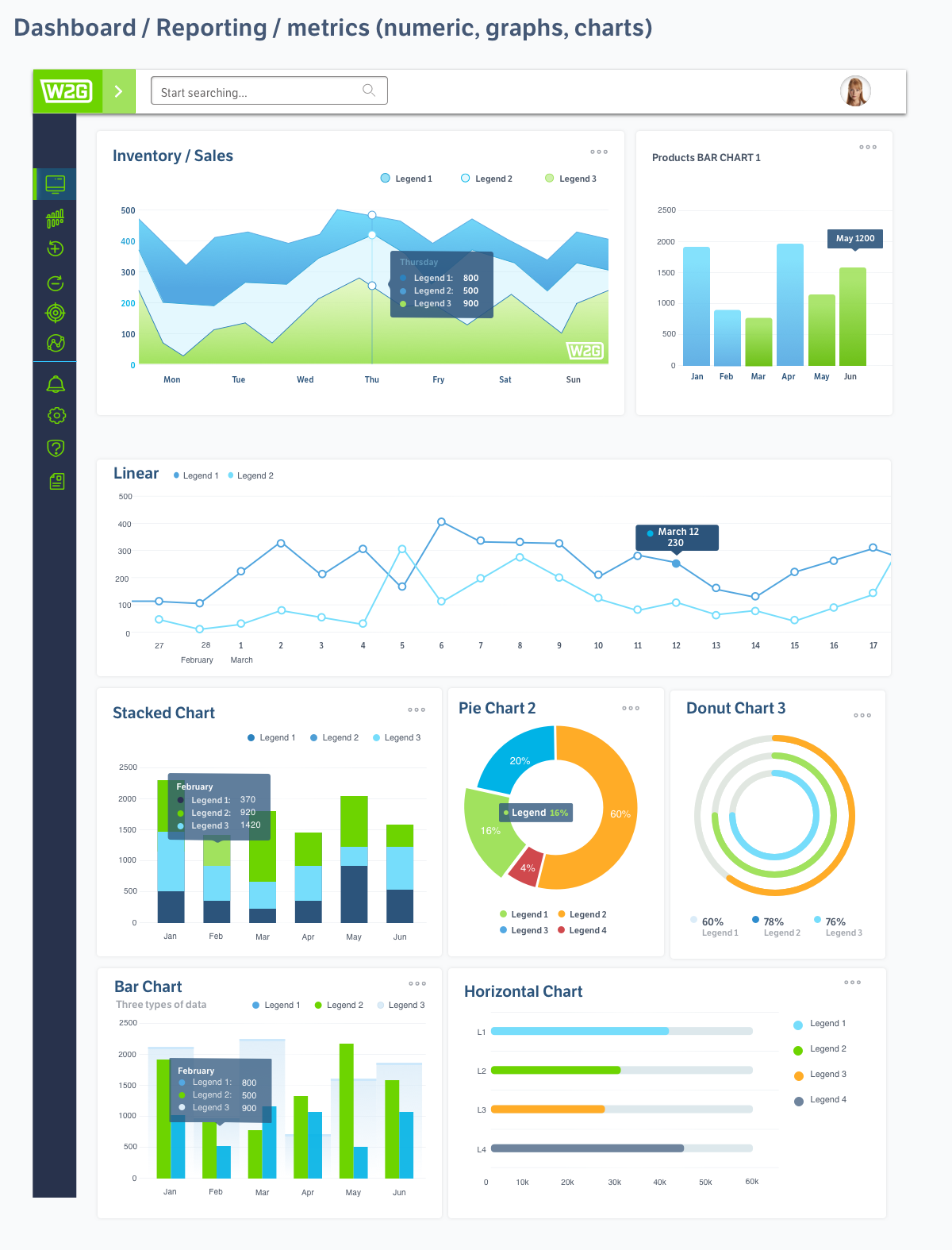
Click image to enlarge view.
Ware2Go had hired a design firm to create a navigation. However, They wanted more of an enterprise design and not an ecommerce solution. I created the vertical collapsing navigation on the left that follows the user throughout the experience; allowing them to quickly access different sections or collapse the navigation for data visualization..

\