Dispatch & Routing – Waste Management Software for Starlight
Speedy, Accurate, Flexible
Starlight Software Solutions contacted me after seeing my work for Waste Applications. I was hired as the UX Designer, Researcher, and UI Designer. I first start with discovery and research, evaluating the existing legacy application – doing a basic heuristics evaluation. I evaluate user feedback and prepare discovery phase research and testing using Maze.
Research: Discovery Phase
Goal: maximize value and reduce effort.
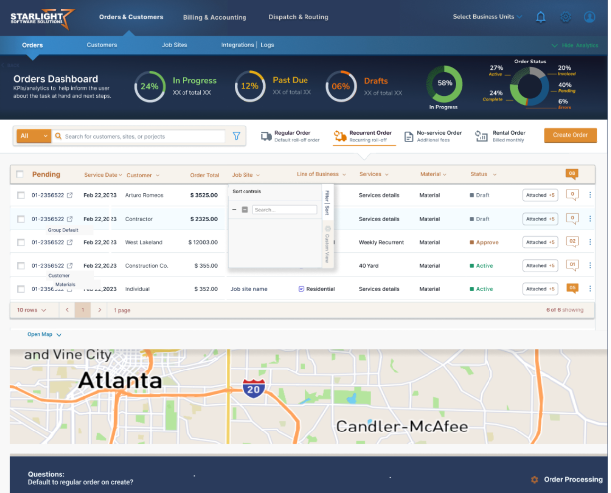
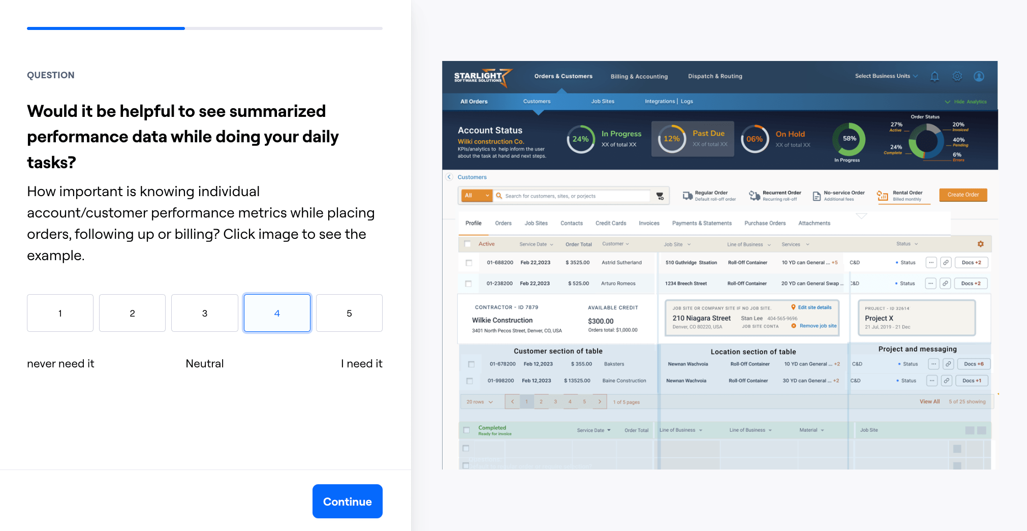
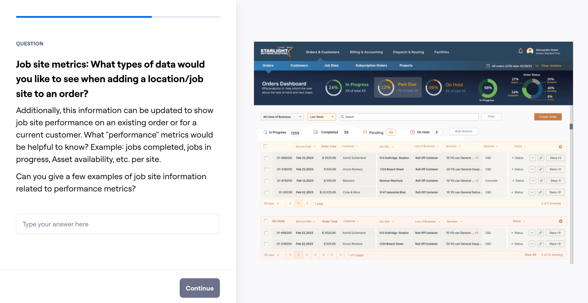
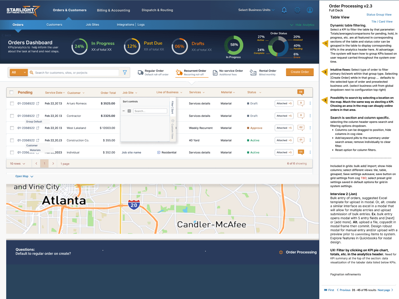
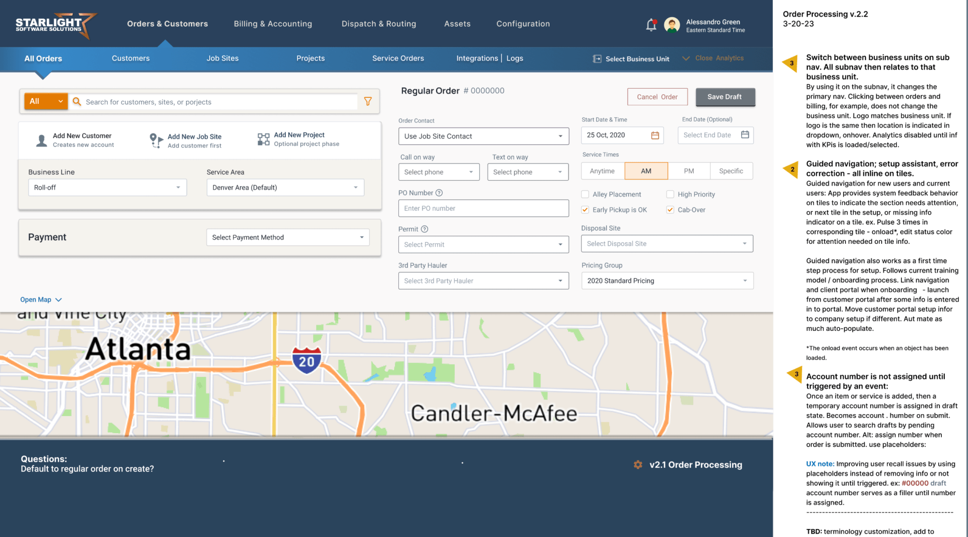
Designed specifically for mapping and tracking dispatch and routing services; as well as, providing complete oversight into asset revenue, vehicle performance and account aging with flexible reporting to enhance productivity throughout the application. Internal communications system and auditing were a huge part of the overall buy-in. We wanted to know what numbers user value and what KPIs are driving them up or down. Discovery research is about maximizing value and reducing effort.
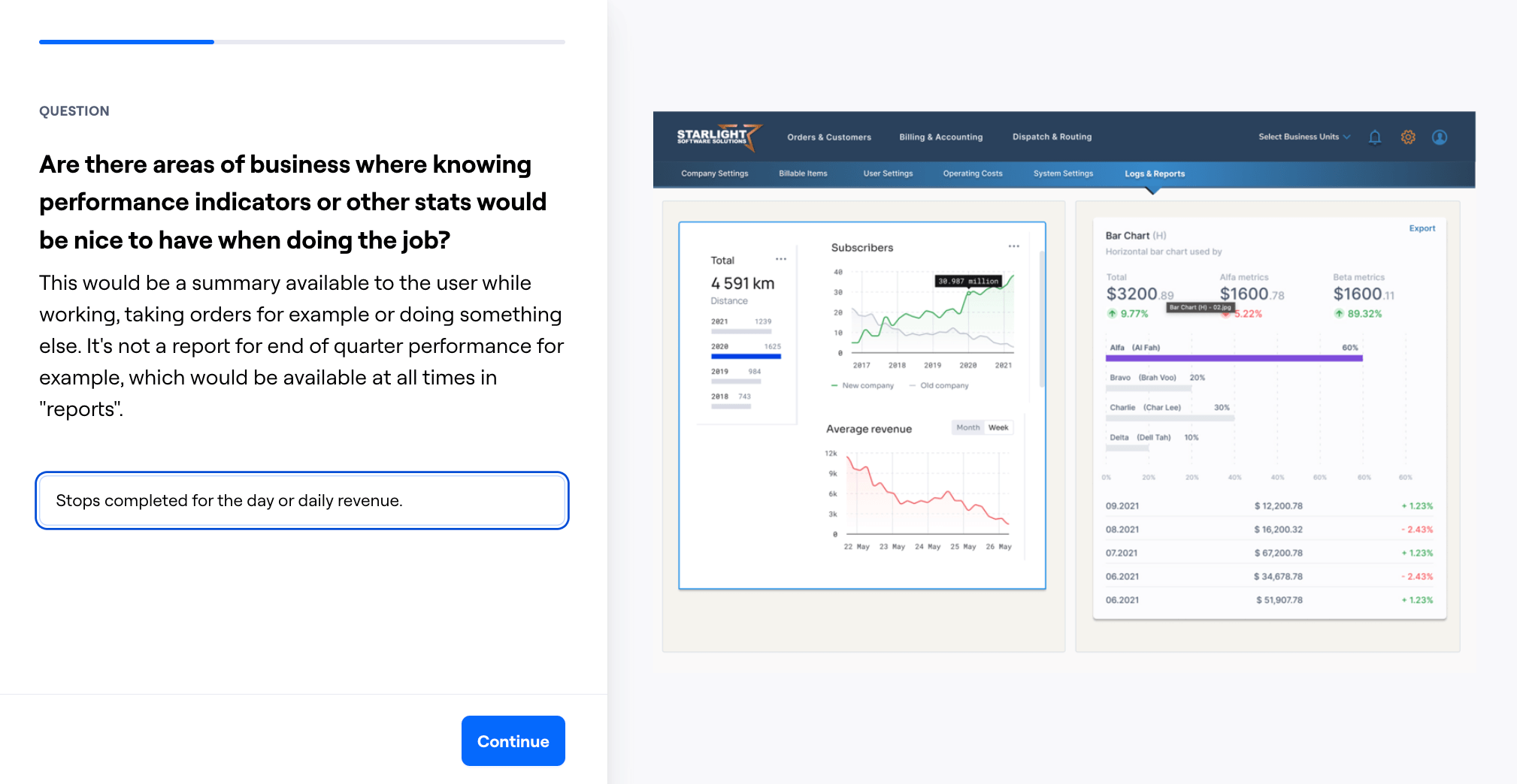
The contrast between the content data and the surrounding background controls makes data visualization easier with less eye strain. Viewing large amounts of information for extended periods of time without eye fatigue is fundamental to the overall structure of the information and how it’s displayed.
Inter is a typeface carefully crafted & designed for computer screens. Inter features a tall x-height to aid in readability of mixed-case and lower-case text. Several OpenType features are provided as well, like contextual alternates that adjusts punctuation depending on the shape of surrounding glyphs, slashed zero for when you need to disambiguate “0” from “o”, tabular numbers, etc.
Natural, Uniform Tones
Midrange colors and muted tones, using minimal white reduces eye strain and the need for dark modes. Starlight has eliminated white as a background container. In the real world, one never encounters true white or black — only varying degrees of light source intensity and subject reflectivity. Therefore the concept of dynamic light-to-dark range becomes more complicated, and depends on whether you are describing a capture device (such as a camera or scanner), a display device (such as a print or computer display), or the subject itself.
Muted, natural tones with a low dynamic range allow for more prominent data presentation for the task at hand. The data set is the most prominent element (text color is darkest in the palette) as it should be. By only using the darker end of the dynamic range for task related data, the user is not distracted by surrounding information unrelated to the task at hand.