[vc_row][vc_column width=”2/3″][vc_column_text css_animation=”fadeIn”]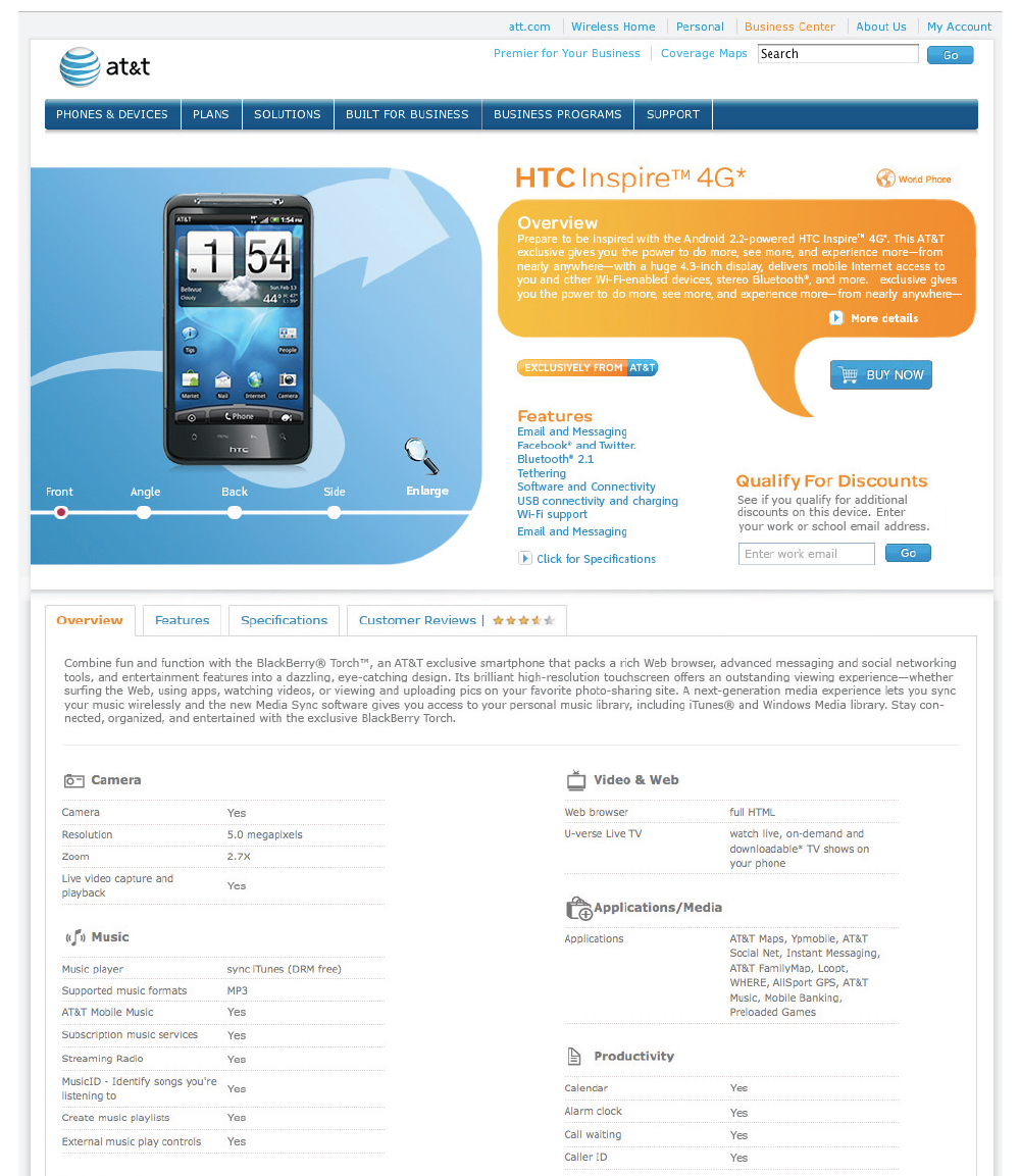 [/vc_column_text][/vc_column][vc_column width=”1/3″][vc_column_text]
B2B Device Landing Page UI Design
My Role: UI update – I rebranded the device landing page to be AT&T Brand 3.0 compliant. My team decided to update the UX as well as the look and feel of the UI during this rebranding process. This involved adding the colorful top section but also a tab system that used icons and information to explain the product in more detail. As the “features” are hovered over the relevant content loads in the orange speech bubble when selected from the blue linked features list below it. The “enlarge” icon is a new feature I introduced for better product familiarity.
Date: July 30, 2012
[/vc_column_text][/vc_column][/vc_row]