[vc_row][vc_column width=”2/3″][vc_column_text css_animation=”fadeInDown”]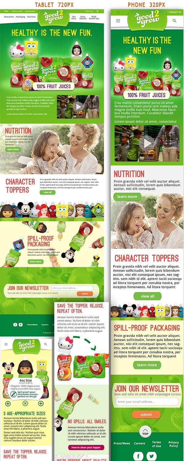 [/vc_column_text][/vc_column][vc_column width=”1/3″][vc_column_text]
Adaptive vs. Responsive UX Design for Multiple Screen Sizes: Good2Grow
Skills: Graphic Design, UI Typography, CSS3, Preparing UI Assets Development Teams
Project: Create a mobile version of Good2Grow’s website – The differences between responsive and adaptive design approaches spotlight important options for us as web and app designers. Choosing with insight can empower you to plan and execute your designs with better aim, purpose and results.
Solution: With the pervasiveness and diversity of mobile devices, as a designers I needed to redesign this UI to fit the variety of screen sizes. To bridge the gap between devices, I have two options: the adaptive site or the responsive site. This solution is a responsive reorganization of the graphic elements requiring customized CSS for each screen size.
Role: UI Design Consultant – The Morrison Agency, Atlanta
Short-term contracted position to fill an immediate client need. Worked closely with multi-disciplinary teams to establish best practices for responsive design mock-ups with three breakpoints to accommodate a variety of mobile screen resolutions. Worked closely with Chief Digital Officer and development teams to define user tasks and behaviors
Date: December 2013[/vc_column_text][/vc_column][/vc_row]