[vc_row][vc_column width=”2/3″][vc_column_text css_animation=”fadeIn”]
 [/vc_column_text][/vc_column][vc_column width=”1/3″][vc_column_text css_animation=”fadeIn”]
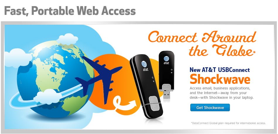
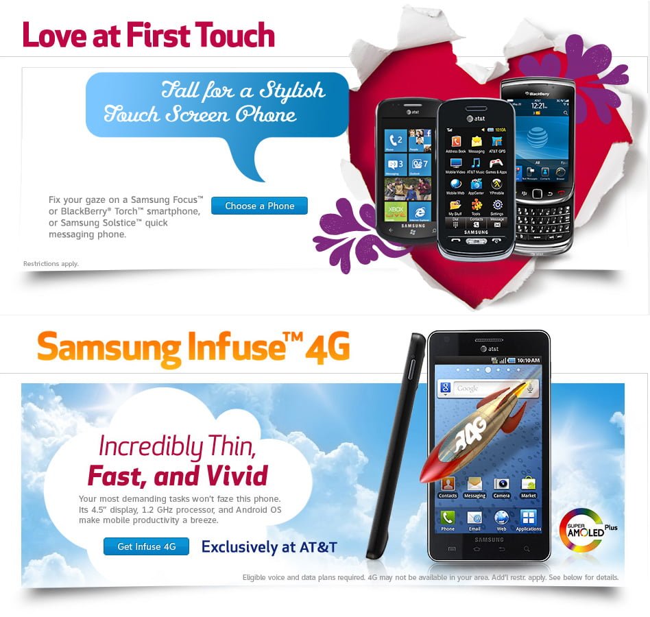
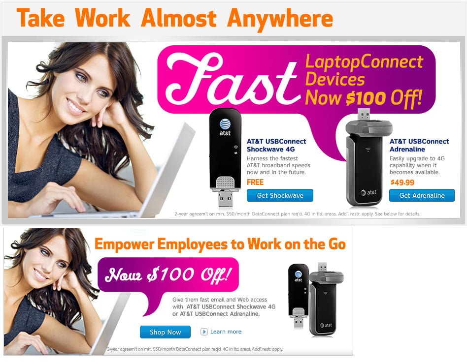
New Product Launch Banners:
Skills: UX Content, Graphic Design, Online Marketing
Project: Banner design for AT&T B2B new product campaigns. I received copy from marketing department, listing many features and promotional information that I had to condensed to fit and target product features of the design.
Date: April 04, 2013
Solution: I often modify long marketing text into short “hooks” to fit space. I work with marketing departments to make edits and get final approvals. I sourced all lifestyle images from stock inventory and used AT&T branding styles to create related graphics.
The UX in Graphic Design: Designing banners requires a specific information architecture (IA) that will drive the eye to the key part of the banner – the CTA (or call-to-action). CTAs are important and often follow the ad hook (short copy that inspires interest). Even though more experienced users know to click a banner image, asking them to either “buy now” or “read more” provides an expectation after click. To avoid ad blindness, banner’s must be powerful and graphical in a small space.
- Working with marketing material. Most users will only glance at a banner ad. I communicated with the marketing department to reduce product information to the essentials. With some debate we arrived at reduced copy that would work. The fonts, colors and images are all important to get the users attention and should be chosen carefully to drive attention to important parts of the banner like the call-to-action button.
- A clear call to action is another essential element. It should be instantly apparent what will happen should the user click on the ad or button. An ad should explain clearly where the link will take them and the benefits of clicking.
- A landing page that is similar in design to the advertisement. Because I designed the related marketing material like the landing page and launch email, the user lands on a page that looks similar to the ad to improve engagement. 58 percent of respondents suggested that when ads aren’t relevant to landing pages that the likelihood of engagement was reduced.
[/vc_column_text][/vc_column][/vc_row]
